More color, more fun.
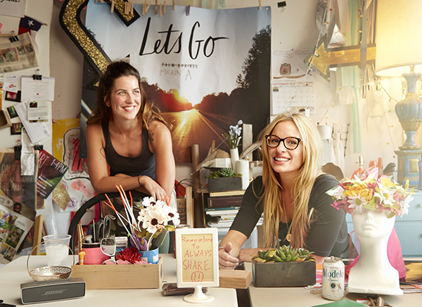
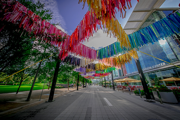
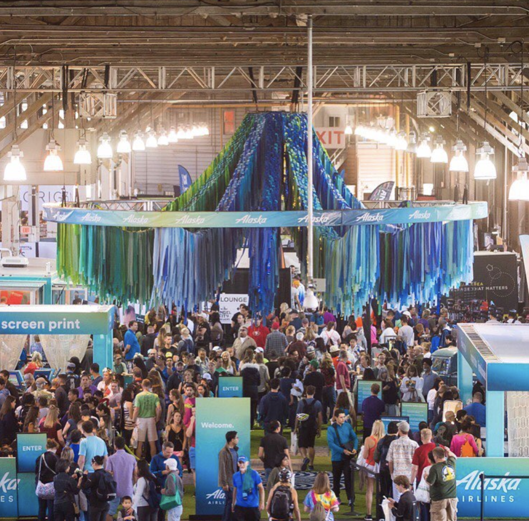
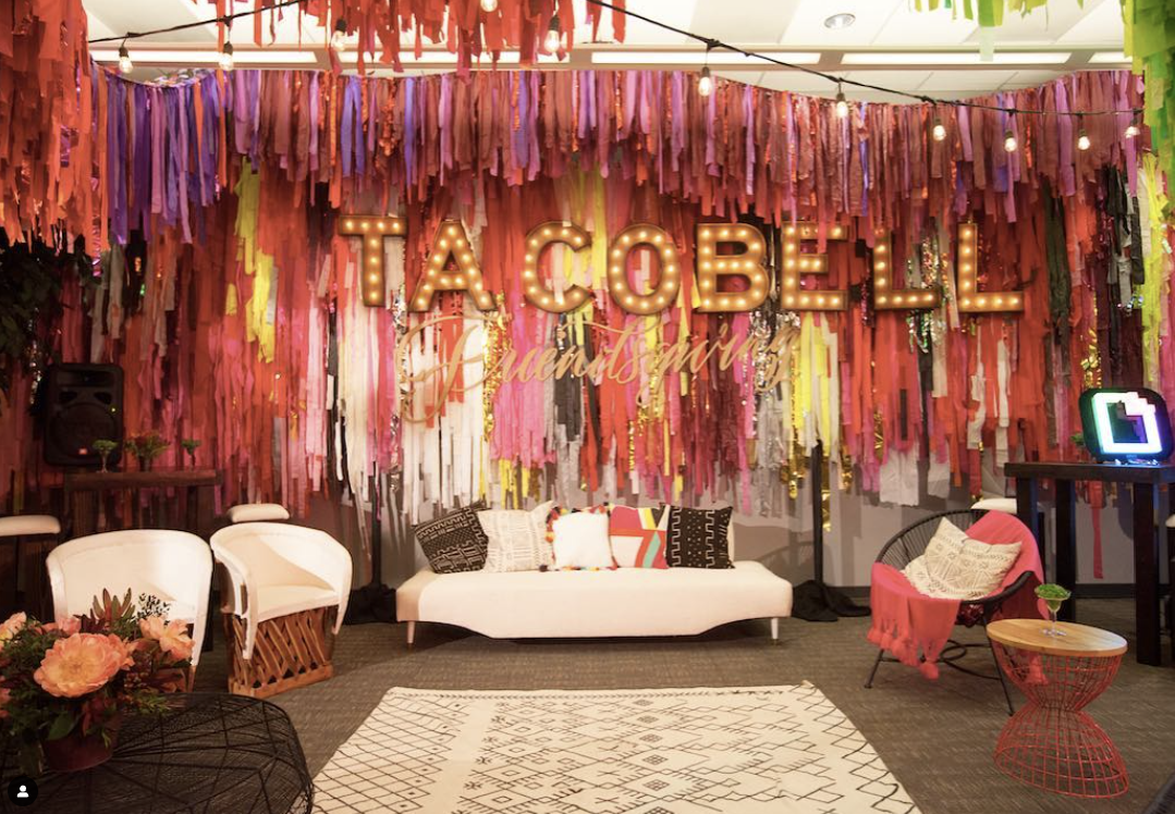
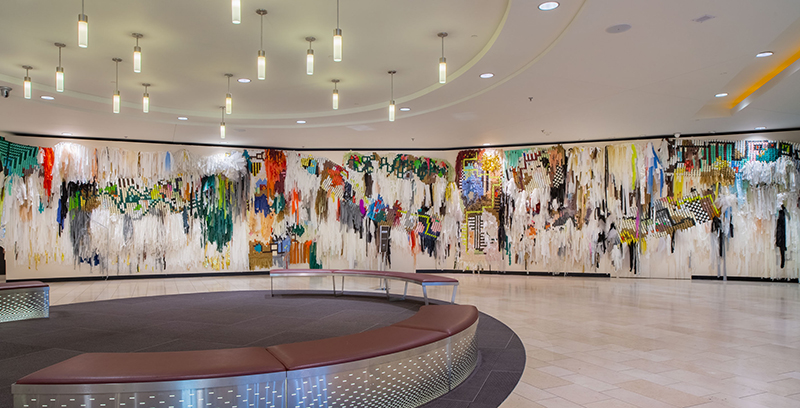
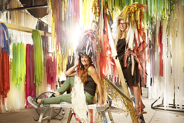
Sunny and Marianne are behind the fabulous artist collaboration and event decor business called Color Condition.
These two have color bombed events from coast to coast for the past decade. Their work is show-stoppingly fun and engaging. Been to SXSW in Austin? You've seen the CC's work in person. Fashion Week in NYC? Been there, done that.
When they came to us for a rebrand and updated online presence, we acted cool, but we were jumping for joy on the inside. So much color to work with! Currently, they are a work-in-progress at JP&CO. Round 1 (branding) is done. We are now building their online presence with a new website. It's already so much fun to see! Stay tuned for their total online transformation.
The color of fun.
Color Condition is about artistic space activation for events, outdoor spaces, and private celebrations.
Marianne and Sunny, the owners of Color Condition, were ready to have a brand image that matched the level of their creativity and their price points.
We looked at competitors, alternative competitors, past events, publicity, and social media data to help us consider the right path for their next-phase brand redo.
We also conducted an in-depth interview with Marianne and Sunny to be sure the branding matched their personalities - which is the personality of the business. We came away with fun, colorful, and full of imagination.
Services Provided: Creative Direction, Branding, Copywriting, Art Direction, Website Design+Development
More is more fun.
Their brand image needed to match the color and vibe of their work. Their aesthetic is based on color • movement • pattern, and we wanted to match that aesthetic as closely as we could in the imagery and font choices.

Julia did a great job translating what we do into words. And our branding accurately reflects the personality of the business. It's exactly what we needed (and wanted)!
Marianne Newsome
Get the right words. Get the right audience.
